Well, of course blurry code is bad!
Code must be clear and precise, who’d think otherwise?
This is what you’ve probably thought the moment you saw the title of this post.
You surely are right, of course.
But that is not what this post is about.
By “blurry”, I do not refer to the meaning of the code.
I refer to the very visual look of the code.
How it is written, not what is written in it.
Code Smells
If you are long enough in the SW business, you’re probably familiar with the term code-smell. If not, it is quite simple: a code-smell is a possible indicator of a problem in the code or design. Code-smells are not bugs, nor are they necessarily a sign of bad programming. Rather, they suggest taking a second look at the code (and possibly refactoring it), as they might reveal a deeper problem.
Blurry Code
In Deconstructing Harry, Mel (Robin Williams) can no longer play, since he’s getting out of focus. This is a known actors’ disease, as it turns out. He has to stop the scene and go home to his family. Of course, even in his sad conditions, his family and everyone else can still recognize him. The same is true for code.

When I am about to review the code of an employee or a colleague, I usually start the process before even getting seated near the computer. One or two meters before it, to be precise. On my way to the computer I get a glance of the screen; many times, it can already teach me a lot. Good code is usually written in a common structure and indentation. Bad code can also be nice to the eye, but there are some patterns of bad-coding that can be spotted visually, without even reading it.
Try it Yourself!
Following are nine screenshots of some blurry code. See if you can spot possible problems, if there are such.


Did you?
Which of them seems to be a rather clean code?
Here’s what I think when I see typical code similar to the patterns above.
Code Example 4
Let’s start by the most obvious example:

The problem in this screenshot is very easy to spot.
Lines that exceed the editor limit are never a good idea.
Reading them is not only hard, but requires manual scrolling.
Just don’t.
And why one needs that long lines in the first place?
It can very much imply on some other problem, like:
- Too long, hard-to-read names
- Too many function arguments
- Complex logic that is at a different level of abstraction
- Complex
ifconditional, which is both hard to follow and easy to get wrong if it gets changed in the future
The latter items are, themselves, possible indicators of violating the SOLID principles. Especially, SRP (Single Responsibility Principle) and OCP (Open/Close Principle).
Possible problems: Readability, Maintainability, SRP, OCP.
Code Example 8
This screenshot looks completely different, but the problems it might imply are very similar.
The code is just too dense.
It’s hard to read it.
And, like the former one, it might be a symptom of other problems, like too many function arguments or too complex conditionals.
It’s worth careful reading to understand if there really are reasons for refactoring.
Possible problems: Readability, Maintainability, SRP, OCP.
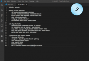
Code Example 2
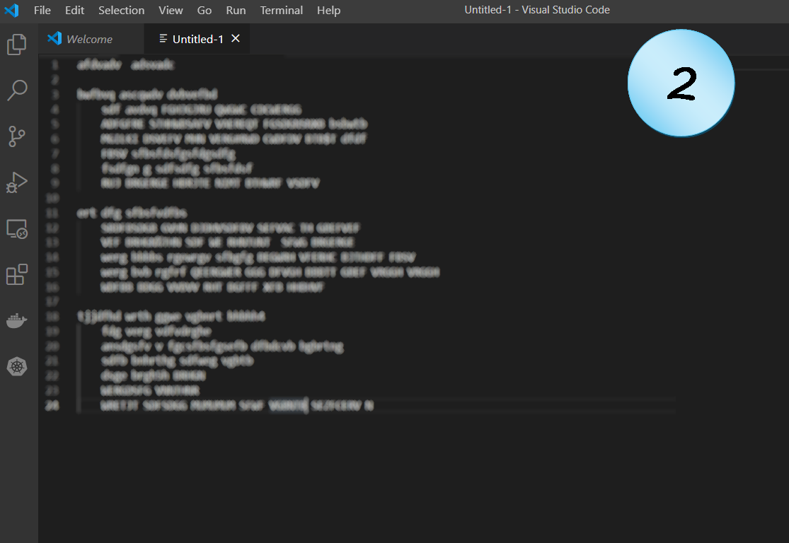
Not as dense as the former example, but it seems that someone didn’t skimp on capital letters here.
Just like in common texts, USING A LOT OF CAPITAL LETTERS IS ANNOYING. True; programming languages do use capital letters for specific needs, like constants or macros. But this does not change the fact that such code is usually hard to read.
So, there might be a good reason for using them that way. But it worth considering it again, and try to refactor the code to some more readable form. For example, shortening names, splitting to more lines, hiding behind functions, etc.
Possible problems: Readability.
Code Example 1

This code seems to be some “multiple choice” structure, e.g. switch-case or if-else-if.
Every time one sees that pattern, the first question is: is this the right solution here?
Maybe it is better to use some more generic structure (e.g. polymorphism)?
Usually, it is better to choose a solution that obeys the Open/Closed Principle. Yet again, simplicity and other reasons are sometimes in favor of “multiple choice”.
In this specific pattern, however, there’s a more suspicious section.
Most of the “choices” are a lot a like: one line of condition, one line of action. But look at lines 20–25: they break that structure. Maybe they represent a split to a secondary choice. Maybe they just represent some more complex action. Either way, these lines are most probably not belong here. They probably deal with a different level of abstraction than the rest of the code, which in turn violates the Single Responsibility Principle.
Possible problems: OCP. SRP.
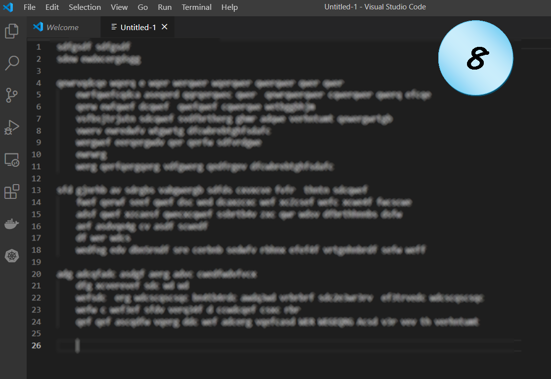
Code Example 3
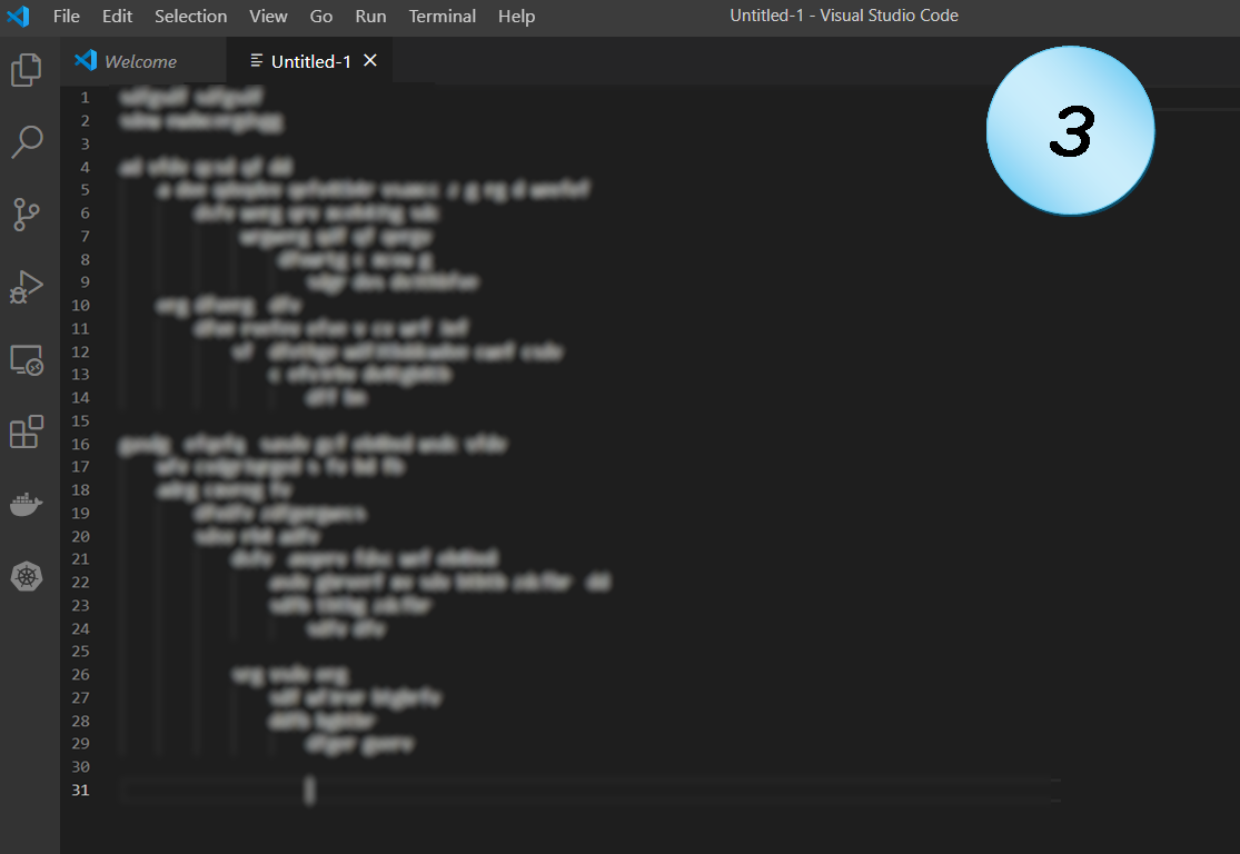
This is a perfect example for a horrible pattern that is too widely seen in codebases.
How many blocks of code are there?
At first look, there are four line groups that stand out (beginning in lines 4, 10, 16, 26). A bit more careful look shows that only two of them begins at the leftmost level, so (hopefully) those are two blocks of code. Maybe two functions. But their nesting… What a nasty nesting!
Four, five, maybe more levels of nesting. No one can really read such code easily. It might be reasonable to have two-level nested loops, e.g. for a table or matrix. Maybe even 3, for the x, y, z dimensions of some cubical data. And even in such cases, the loops must be the simplest for-all type. Otherwise, it probably violates the Single Responsibility Principle. But more than that, it requires the maintainer of the code to keep track of what happens at each level. Nasty.
When there are as many levels of nesting as in that example, it is almost impossible to keep track of the logic even if for the trivial “for-all” case. With such a complex logic, the code should probably be broken to several functions.
What else?
Both lines 5 and 10 are the beginning of such a nasty nesting.
So, even before talking about nesting levels, having those two code-chunks in a single function probably violates SRP.
Lines 21 and 26 are even worse: they split an already too-deep nesting into two paths. Imagine an innocent programmer in the future that have to fix or update this code. Most chances are that it will take a lot of time to make sure that they’re doing it right. And most chance are, that they are not.
The above assumes that those are loops. If they aren’t, things are probably much worse. If this is some conditionals nesting, it is arranged very badly. If this is not a real nesting but only some strange way of indentation… Well, I hope it isn’t. I really do.
Possible problems: Readability, Maintainability, SRP, OCP.
Code Example 5
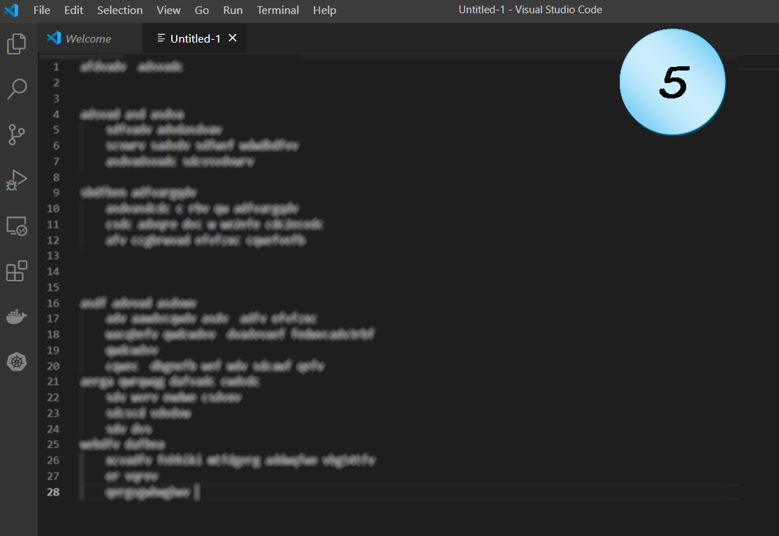
Well, this is just sloppy.
Why is the code arranged so strangely?
Two blank lines, three blank lines, none at all… Is there a good reason for that?
There should be a clear (and reasonable) convention that the code must follow.
Unless there’s a really good reason for that code, it makes it hard to read.
Possible problems: Readability.
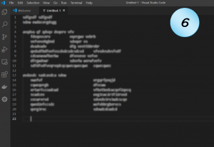
Code Example 6

Do you recognize this code pattern?
I hope you don’t, but if you are a real code veteran you have almost surely encountered it.
Maybe for enum values, or for the types and names of some struct. Maybe for listing the keys and values of amap or a dictionary.
The pattern of using two-columns indentation was very popular in the past. Happily, it is much less popular today, and there’s a reason for that.
The first block provides a great demonstration for why not: most of the code is in two-columns form. However, two lines (8 and 11) break that form. Probably a result of a later maintenance with unexpectedly long names. So maybe it was readable on its first versions, but not anymore.
The other block is what happens when trying to avoid the first issue. So coders put the two columns in a fair distance, just in case. Which makes it unpleasant to read in the first place, and hard to see in a glance which item belongs to which. Better not to use it at all. Modern IDEs with colored text make it much easier to see what items belong to the “firsties” (e.g., types) and what items belong to the “lasties” (e.g., names), even when separated by a single space.
Possible problems: Readability, Maintainability.
Code Example 7
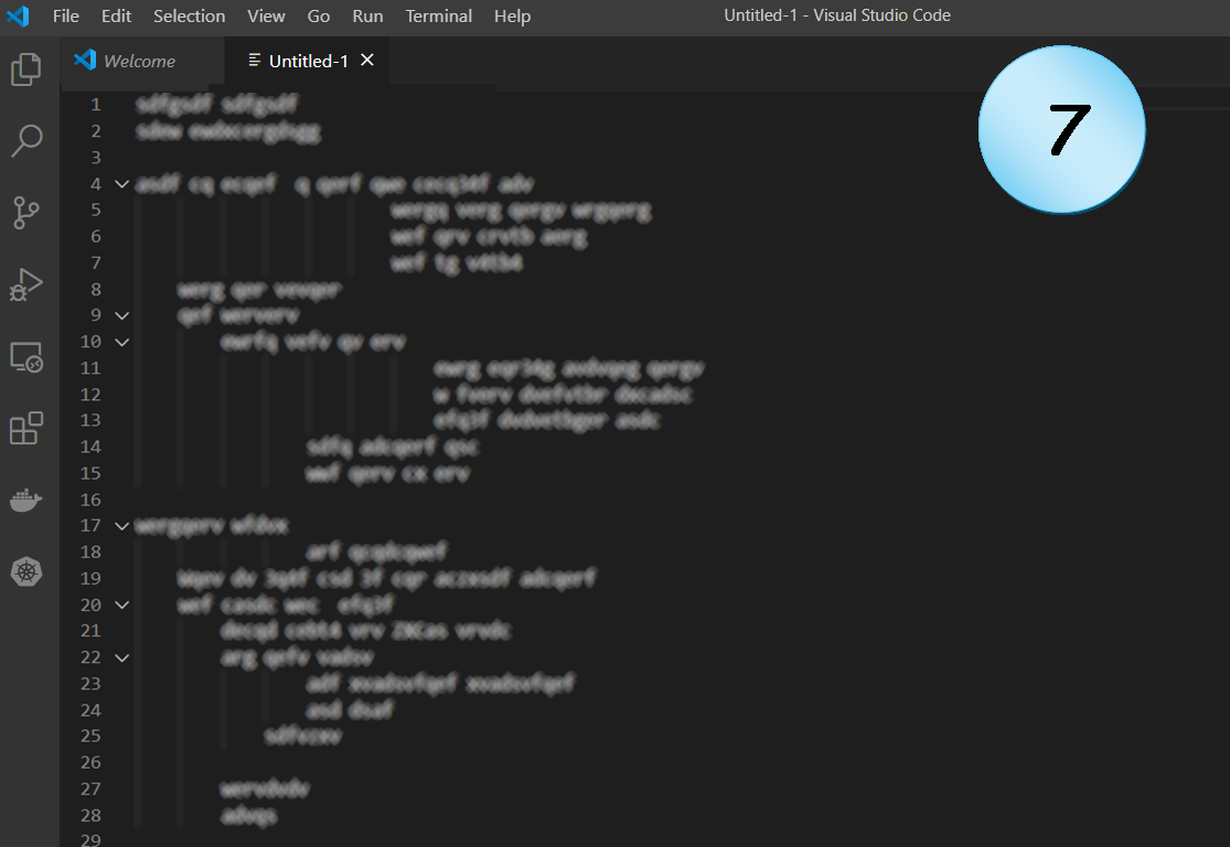
Well, that’s just a shame.
Strange indentation that goes in and out, and makes the reader get lost.
Usually, this is the result of another coding fault, like:
- using too long names
- functions that get too many arguments
- complex statements or expressions (e.g. conditionals)
Therefore, such a code requires a deeper look, not only for making it more readable, but also to make it more maintainable and to not violate principles like SRP or OCP.
Possible problems: Readability, Maintainability, SRP, OCP.
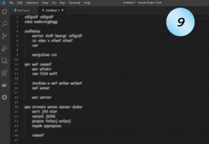
Code Example 9

Code, the way code should look.
It might have bugs, it might be complete nonsense.
But structure-wise, it doesn’t have any suspicious characteristics.
Conclusion
The visual pattern of a code snippet can teach us a lot about its content, and may hint us about possible problems in it. As a coder, you should avoid it. As a reviewer, you should suspect it. As a maintainer, you should pay attention to it. There might be justifications for almost any strange code phenomenon. But those are the exceptions. In most cases, there is no good reason for that. The above examples are some of the most common ones. I’m sure that you have encountered similar ones, as well as many others. I hope that this post will help you sharpen the way you look at code in the future. I will be happy to see more examples.
Good luck!